Naidhruva Technologies logo
  • Home
  • Services
    • Web Development
    • Digital Marketing
    • Mobile App Development
  • Products
  • Case Studies
  • Publications
  • About
  • Contact
Book Free Consultation
Home
Services
Web DevelopmentDigital MarketingMobile App Development
Products
Case Studies
Publications
About
Contact
Book Free Consultation

Website Development Company in Hyderabad
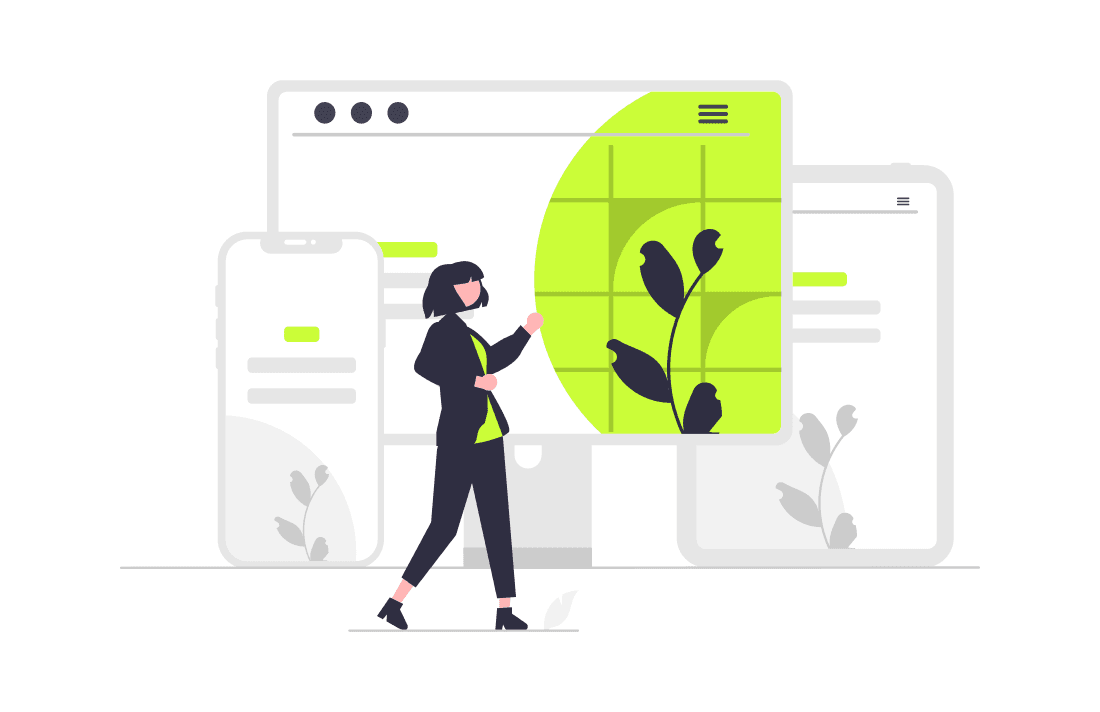
Website development company in Hyderabad for responsive websites, landing pages, UI/UX, CMS, ecommerce, and conversion-focused business websites.
  • Home
  • Website Development Company in Hyderabad

Website Development Company in Hyderabad

Welcome to Naidhruva Technologies, your premier destination for responsive web design solutions that ensure your website looks and performs flawlessly on all devices. In today's mobile-centric world, having a responsive website is essential for providing an optimal user experience and maximizing engagement across desktops, tablets, and smartphones. Our team of experienced designers and developers specializes in creating responsive websites that adapt seamlessly to any screen size, ensuring that your audience can access your content anytime, anywhere.
Website Development Company in Hyderabad — Web Development by Naidhruva Technologies
Problem

The Problem

Many businesses struggle to get real results from responsive web design. Without the right strategy, expertise, and ongoing optimization, you end up wasting time and budget while competitors pull ahead.

  • Your website looks outdated and doesn't convert visitors into leads
  • It's difficult to update content without calling a developer every time
  • Your site isn't mobile-friendly or loads too slowly
How Naidhruva Solves It

How Naidhruva Solves It

At Naidhruva Technologies, we take a results-first approach to responsive web design. We don't deliver generic templates — we build strategies and solutions tailored to your business, industry, and goals.

Mobile-First Approach:

We adopt a mobile-first approach to web design, prioritizing the needs of mobile users and designing for smaller screens first. This ensures that your website is optimized for mobile devices and delivers a consistent and intuitive experience across all platforms.

Fluid Layouts:

Our responsive websites feature fluid layouts that dynamically adjust and reflow to fit the screen size of the device being used. Whether it's a smartphone, tablet, or desktop computer, your website will adapt effortlessly to provide an optimal viewing experience for every visitor.

Media Queries:

We leverage CSS media queries to apply different styles and layouts based on the characteristics of the user's device, such as screen width, resolution, and orientation. This allows us to tailor the design and content of your website to suit the capabilities and limitations of each device.

Flexible Images and Media:

We use techniques such as responsive images and scalable vector graphics (SVGs) to ensure that images and media on your website are displayed crisply and proportionally across all devices. This prevents distortion and ensures that your visual content looks stunning regardless of screen size.

Benefits

Benefits of Working With Us

  • A professional website that builds trust and drives inquiries
  • Mobile-first design that works on every device
  • Easy-to-manage content so your team stays in control
  • SEO-ready structure to help you get found on Google
Our Process

Our Process

01

Discovery & Strategy

We learn about your business, goals, and audience to define a clear responsive web design roadmap.

02

Planning & Setup

We outline deliverables, timelines, and KPIs so you know exactly what to expect.

03

Execution & Optimization

Our team implements your responsive web design solution with regular check-ins and data-driven adjustments.

04

Reporting & Growth

We measure results, share transparent reports, and continuously improve performance.

Results

Results You Can Expect

Our clients see measurable improvements — here's what we aim to deliver:

  • A fast, modern website that converts visitors into customers
  • Improved search engine rankings over time
  • Reduced bounce rates and longer session times
  • A digital presence you're proud to share
FAQ

Frequently Asked Questions

Responsive web design is an approach to designing and developing websites that ensures they look and function optimally across all devices, including desktops, tablets, and smartphones. It's essential for providing a seamless and consistent user experience regardless of the device being used, ultimately leading to higher engagement and satisfaction.

Traditional web design typically involves creating separate versions of a website for different devices, such as a desktop version and a mobile version. Responsive web design, on the other hand, uses flexible layouts and CSS media queries to adapt the design and content of a website dynamically based on the screen size and resolution of the user's device.

Responsive web design offers several benefits for businesses, including improved user experience, increased mobile traffic and conversions, better search engine rankings (as Google prioritizes mobile-friendly websites), easier maintenance (as there's only one version of the website to manage), and enhanced brand perception and credibility.

Our team follows best practices in responsive web design, including adopting a mobile-first approach, using fluid layouts and flexible grids, implementing CSS media queries, optimizing images and media for various screen sizes, and conducting thorough testing across different devices and browsers to ensure compatibility and performance.

Yes, responsive web design is inherently SEO-friendly, as it ensures that your website is accessible and user-friendly across all devices, which is a key factor in Google's search ranking algorithm. Additionally, having a single URL for your website simplifies SEO efforts, as there's no need to manage separate URLs for different devices.

The timeline for creating a responsive website can vary depending on factors such as the complexity of the project, the size of the website, and the availability of content and assets. Generally, smaller websites may take a few weeks to complete, while larger and more complex websites may take several months.
Still deciding? Ask directly and we’ll guide you clearly.Still Have Questions? Contact Us
← All Web Development ServicesView Case StudiesFree Marketing AuditAbout Naidhruva

Ready to Get Started with Responsive Web Design?

Contact us today for a free consultation. We'll review your needs and share actionable recommendations — no obligation.

Get Free Consultation

Get Free SEO Audit

Naidhruva Technologies logo
We help businesses generate more leads through SEO, Google Ads, high-converting websites, and digital marketing. Based in Hyderabad, serving clients across India and worldwide.

Phone: +919491446694

Email: info@naidhruvatechnologies.in

  • Home
  • About Us
  • Case Studies
  • Contact Us
  • Web Development
  • Digital Marketing
  • Mobile App Development
  • Publications

Google Business Profile

Copyright 2026 Naidhruva Technologies. All rights reserved.
NAIDHRUVA